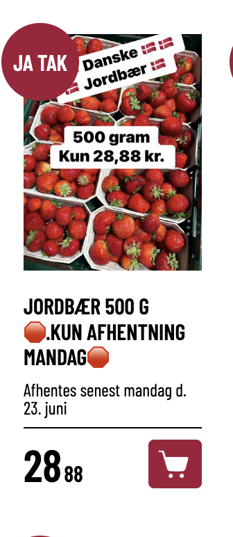
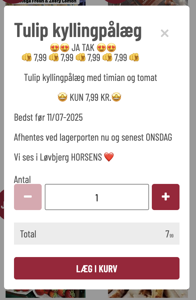
JAKTAK Løvbjerg
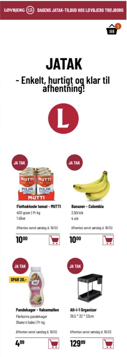
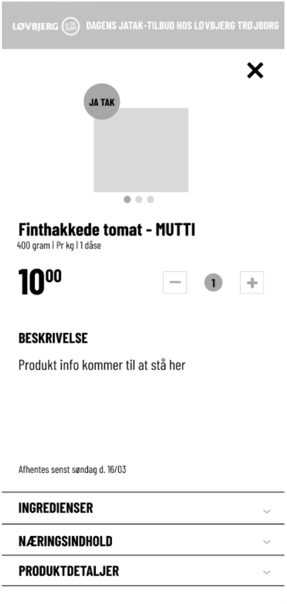
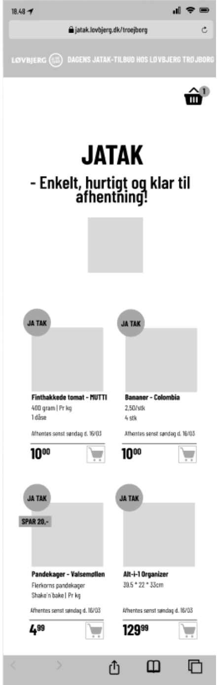
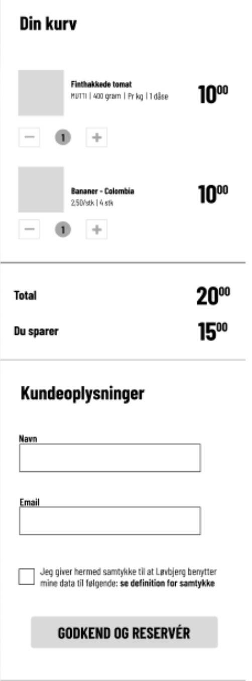
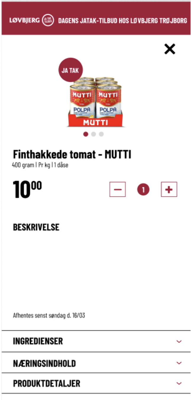
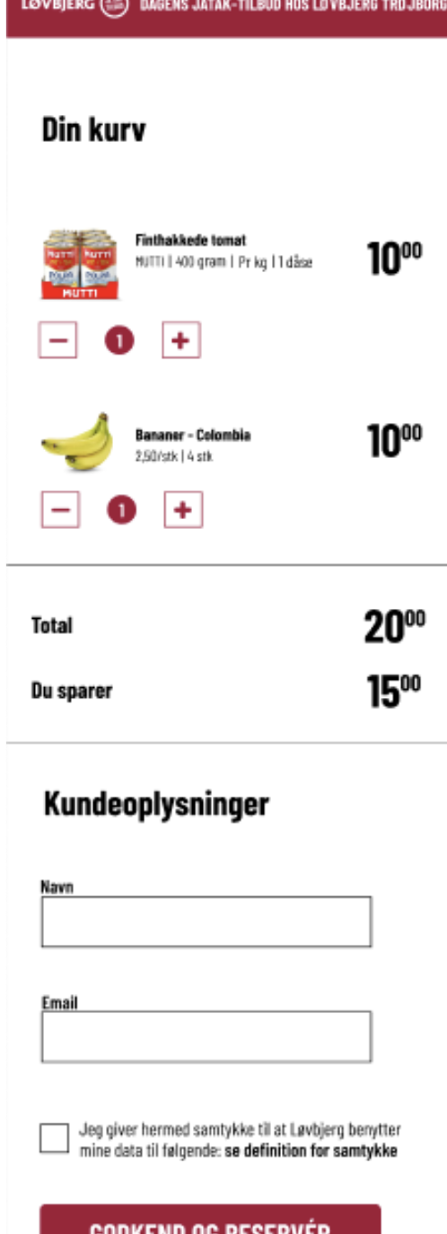
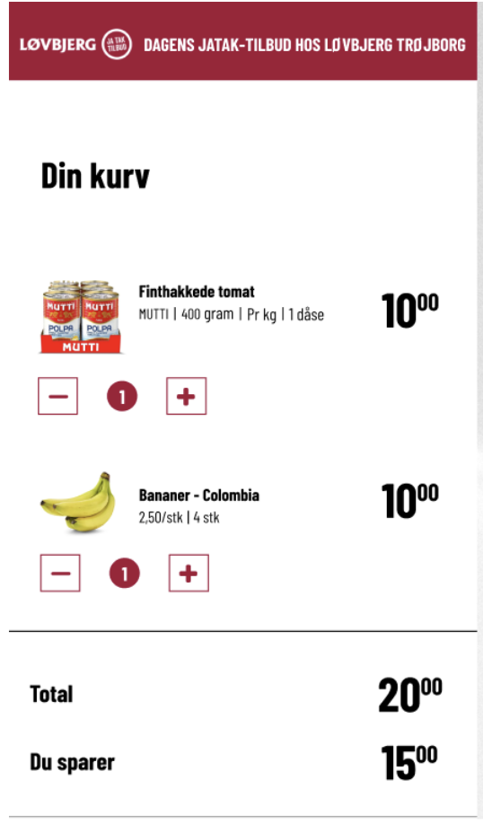
Screenshot of the “JATAK” mockup from Figma
The optimisation of the JATAK page was my final exam project in the Multimedia Design programme.
(The project was successfully implemented)
Project
Website.
Date
2025.
Systems
I worked with Figma, Canva, HTML, CSS, wordpress and WooCommerce.
Who is
Løvbjerg
Løvbjerg is a Danish supermarket chain founded in 1926. It is primarily located in Jutland and on Fyn.
What was the objective?
How can a UX/UI optimisation of Løvbjerg’s “Yes Please” page improve the digital user experience with the goal of increasing engagement, reducing friction in the user flow, and potentially improving the conversion rate?
What was the problem?
Many companies working to attract users to their online platforms are familiar with the challenge of maintaining user attention and ensuring a seamless purchasing journey. Any friction in the user flow can result in potential customers abandoning their purchase.
Løvbjerg, a company with almost 100 years of history, chose to collaborate with me on my final project. They were seeking help to optimise their “JATAK” page, which was not performing as intended. The current version was developed by backend developers with little focus on user behaviour and needs, resulting in low engagement and fewer conversions.
At present, the “JATAK” campaign performs best through Løvbjerg’s own Facebook page, meaning fewer clicks and a lower open rate on their actual online platform. Løvbjerg is therefore looking for support in understanding how UX/UI improvements can help make the shopping experience more intuitive, engaging, and error-free.
What was the result?
The result was an optimised version of the JATAK page aimed at improving the digital user experience. My focus was to create a simple, intuitive, and functional platform with the goal of increasing engagement, reducing friction in the user flow, and potentially improving conversion rates.
The design was primarily developed with a mobile-first approach to accommodate the main target audience, who mainly shop via mobile devices. I conducted various usability tests, including low-fidelity and high-fidelity testing, to validate whether the optimised design met user expectations.
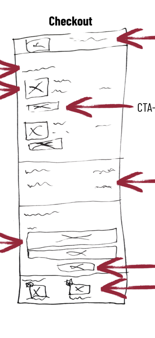
In the development phase, emphasis was placed on improving the visibility of CTA buttons and implementing a simple and intuitive checkout experience. Additionally, web accessibility was prioritised to ensure that users with various disabilities can navigate the platform with ease.
I applied UX/UI principles such as Fitts’s Law and Miller’s Law to create an intuitive layout and effective navigation. General design principles were also used to optimise the JATAK page for both desktop and mobile-first use, resulting in a more responsive and user-friendly solution.
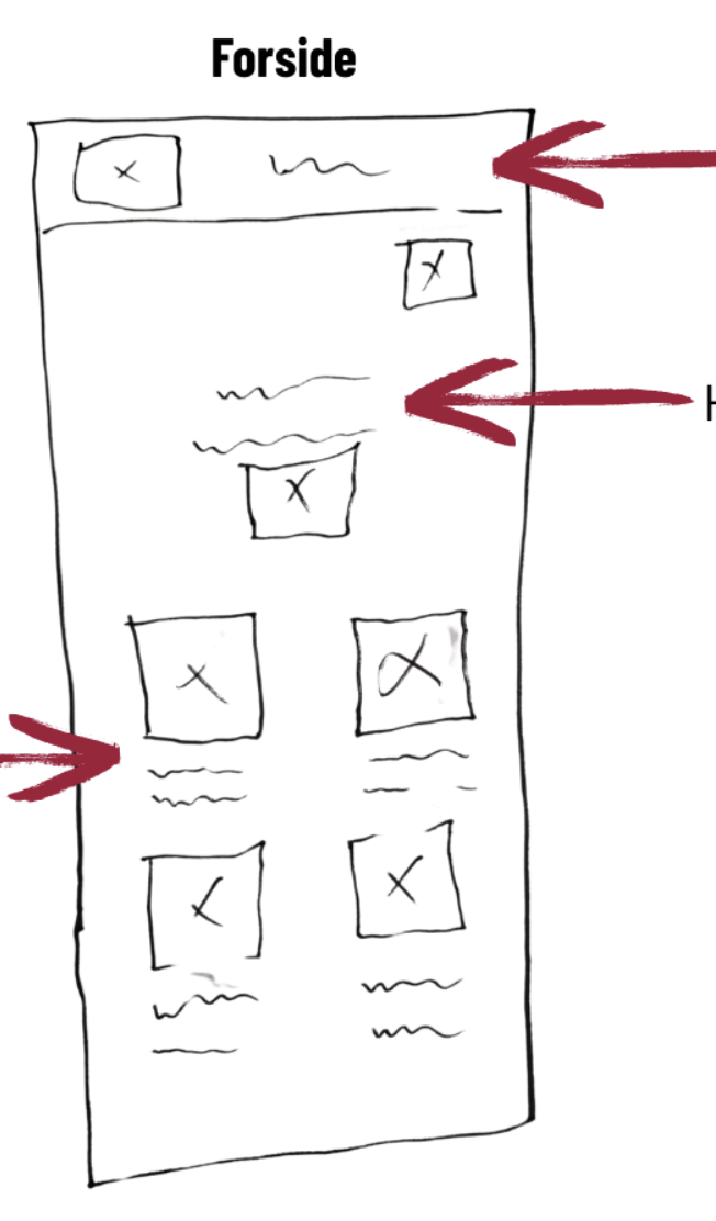
Examples of wireframes, mockups, visual identity, sketches, and more.